Tag: typography
-
Semester Project
I am currently working on my semester project, therefore I have been a bit quite on the blog front. So far I have delivered a product description about my client, logo design, which products I am going to design, justification and challenges with the design. I have also delivered a work schedule for my semester…
-
CA – Graphic Design 2

These past weeks I have been learning about layout design, composition, guidlines, layout principles and so on. It has been some intensive weeks, with a lot of tasks, assignments and an exciting CA brief. I have already written a god deal about this CA’s brief – however, the brief stated that a recipe booklet should…
-
MA01 part 4 – Thumbnail sketches of the layout

I have been sketching and trying to work out the layout for my booklet design. I had these things in mind while sketching: – CDH
-
MA01 part 3 – Moodboard
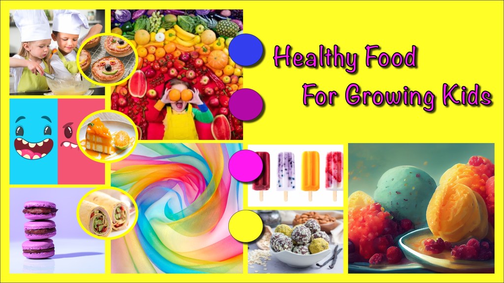
I have created a moodboard for this CA brief with Adobe InDesign. It’s energetic, happy and inspiring for my booklet work. I might adjust the moodboard during this process. This is it, hopefully this will help me with my inspiration and ideation during this creative work. – CHD
-
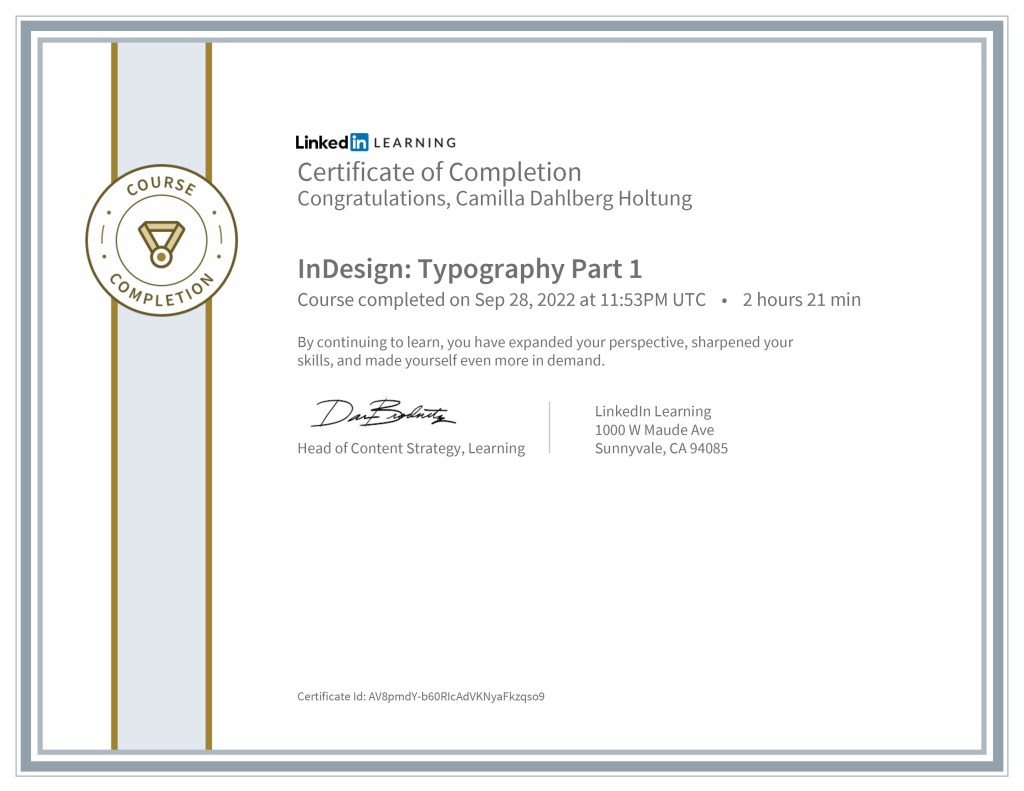
1.1 part 2 InDesign Essential Training

I have been working on this massive and comprehensive course in LinkedIn about InDesign and finally I got my certificate. I have learned a lot during this week, and I can’t wait to use all the new knowledge I now have with InDesign. Especially when it comes to designing and writing the booklet. – CDH
-
CA – Strategic Design 1

I submitted my final design and report on thursday 1 of december, one day before the deadline. After intense work with the design for Fra Gård I just shut down a little while, so I didn’t post about it right away here on the blog. I could reveal right now that I have got the…
-
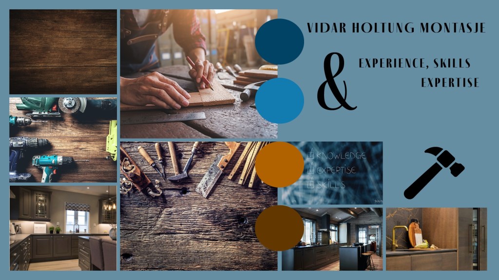
MA02 part 2 – Moodboard

I’ve created a moodboard with my CA brief in mind. I am developing a logo design for Fra Gård and this moodboard represents my inspiration for that logo design. First of I have included two types of typography, Merriweather in a light weight and Beloved Sans in a Regular weight. Both of these typefaces are…
-
CA1 – Book Cover Design

I have been working on this brief for several weeks, and used the two last weeks to finalize the book cover and my comprehensive report. The brief stated that a new book cover for «The Seven Dials Mystery» by Agatha Christie, should be made with a minimum number of colours, include the number 7 and…
-
MA03 – Mood Board
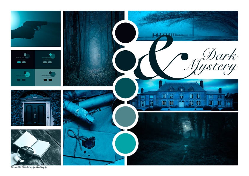
As part of my process of creating a new book cover for «The Seven Dials Mystery» by Agatha Cristie, I needed to develop a mood board to help me. After learning about typography, colour theory and the use of images – I could apply my new knowledge to this project. I used a lot of…
-
3.4(1&2) Fruit Juice Photo Manipulation Effect
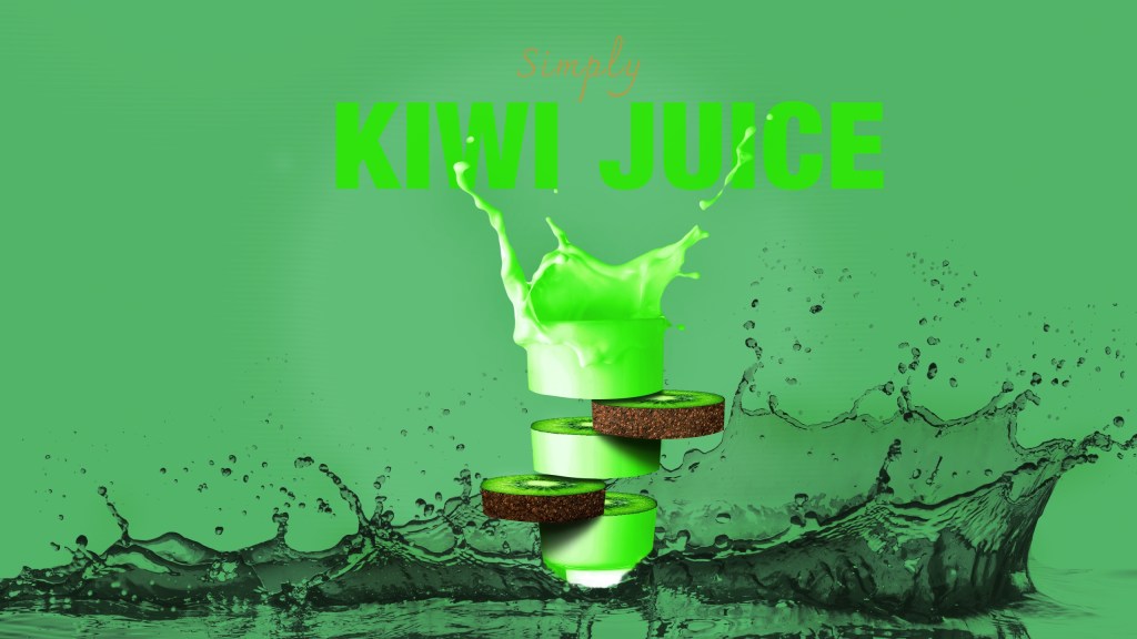
This week I have been using a lot of time reading and studying about images, types of imagery and how to choose the right image. I then followed a learning video created by Tutvid about how to manipulate fruit juice photos. To practise my image sourcing skills, I used different images than in the learning…
-
3.2 Typography 2
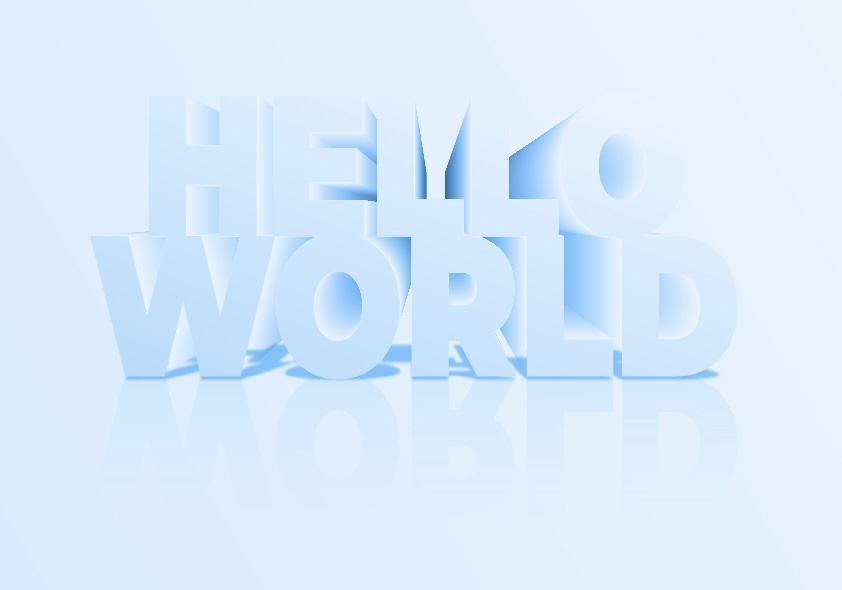
The last week I used a lot of time learning about typography, and how to manipulate text in Illustrator. The lecture videos looked easy and simple to follow, but I got a really hard time with the 3D effect lecture. I used two days to just figure it out, and that’s kind of embarrasing. However,…
-
3.1 Typography 1
One of the most important tools a graphic designer should master – is typography! As a designer we need to be able to use typography in a creative and custom way – know how to make adjustments so we enhance the readability, and make the reader intrigued. As a graphic designer you can also specialise…
-
MA02 – Using Ideation Techniques And Sketching

For this assignment I ended up with using two different ideation techniques, «Morphological analysis» and «Consequences». I need to come up with ideas for my course assignment, where I am creating a new book cover for «The Seven Dials Mystery» by Agatha Christie. As you can see in my morphological analysis I chose to work…
-
2.1(1) The History Of Modern Graphic Design

For this project I’m choosing a design that caught my eye as a book cover, which is influenced by one of the Graphic Design eras: Before I tell you more about the design and designer that I chose to write about. I want to write down some information about each era and some of the…
