As part of my process of creating a new book cover for «The Seven Dials Mystery» by Agatha Cristie, I needed to develop a mood board to help me.
After learning about typography, colour theory and the use of images – I could apply my new knowledge to this project.
I used a lot of time with figuring out my colour theme, and then I tested the colours by making shapes and typography together, mixing and matching the colours.
For my colour theme I ended up with this:
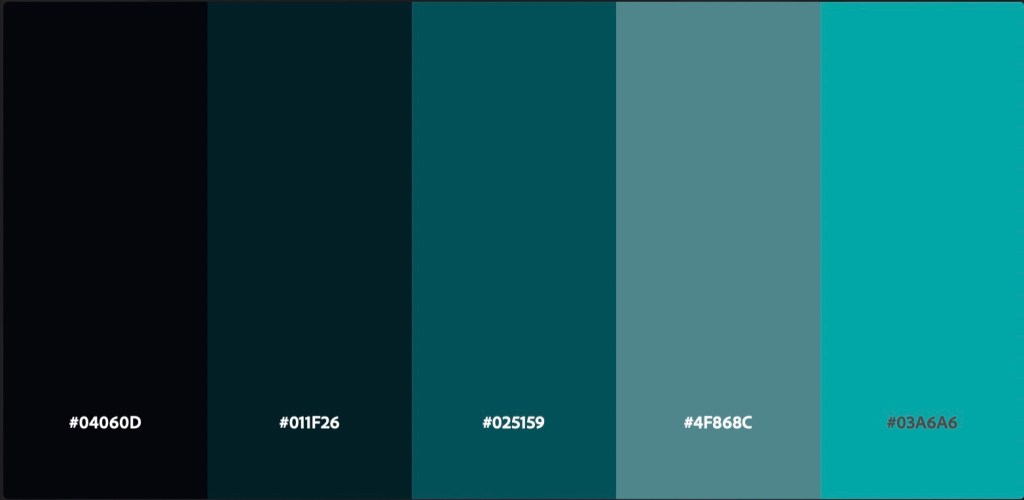
The brief stated that I should use a minimum number of colours and thats why I have this monochromatic colour theme.
This is also a colour theme that I think represents something modern. I want my redesign of the book cover to be more modern than prievious designs.
The colours also give a cold, dark and mysterious vibe. If I where to make another mood board with less restrictions I might want to implement more contrast than I have done with this one.
After figuring out my colour theme, I went on to find my inspirational images with good quality. I found some pictures I liked and that had potential, but didn’t quite have the colours that I needed. So, I manipulated some of the images in Photoshop to make them fit with my colour theme.
One of the images I included in my mood board is one of the first images I found when learning about colour, and it inspired me the whole way with choosing the colour palette for the mood board and the book cover.
I then followed the lecture video on how to make the themplate for mood board in InDesign and how to create a working mood board. Im quite new to InDesign, but I definetly feel like it’s easier than Photoshop.
My mood board (MA03) – «Dark & Mystery»
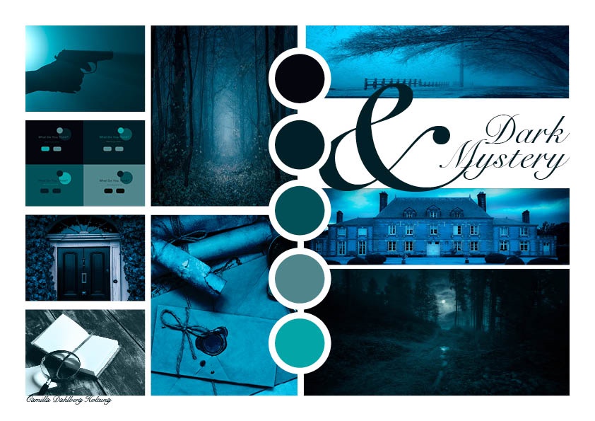
I might tweak and work with this mood board the next two weeks, but this is how it looks for now. It’s going to be submitted with my report at friday 21 of october.
Best regards, CDH

Leave a comment