Tag: digital
-
Semester 2 Schedule 24/25
Schedule 24/25 Screenbased design 1/ UX Design Fundamentals CA 1 Hand out: Monday 13.05.24. Deadline: Friday 4 pm, 06.09.25. Photography CA 2 Hand out: Monday 09.09.24. Deadline: Friday 4 pm, 04.10.24. Screenbased design 2/ UI Design Fundamentals CA 2 Hand out: Monday 07.10.24 Deadline: Friday 4 pm, 10.01.25. Graphic Design CA 3 Hand out: Monday…
-
I AM BACK!

2023 was a very special year for me, in both good and bad. I am going to be completely honest with you, it was though. 23 of march 2023 I was 25 weeks pregnant and working on my semester project everyday. I was really in a perfect creative mode and space! That day I went…
-
Semester Project
I am currently working on my semester project, therefore I have been a bit quite on the blog front. So far I have delivered a product description about my client, logo design, which products I am going to design, justification and challenges with the design. I have also delivered a work schedule for my semester…
-
CA – Graphic Design 2
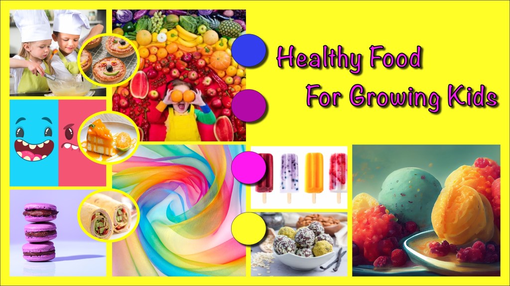
These past weeks I have been learning about layout design, composition, guidlines, layout principles and so on. It has been some intensive weeks, with a lot of tasks, assignments and an exciting CA brief. I have already written a god deal about this CA’s brief – however, the brief stated that a recipe booklet should…
-
MA02 – Layout and composition
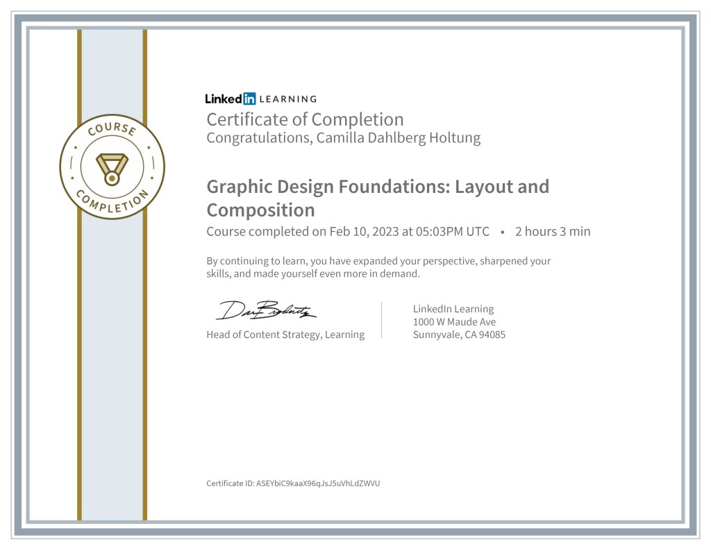
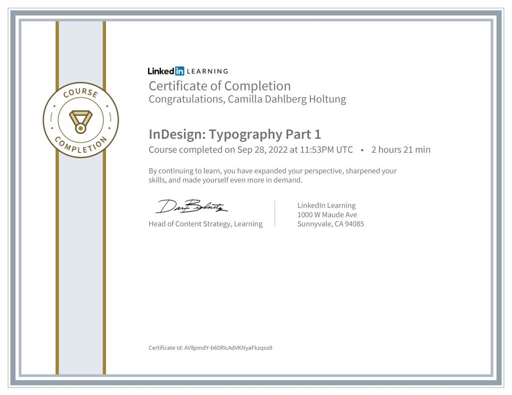
During this GRA2 process I have completed three different LinkedIn learning courses. The first one I published here on the blog a few weeks ago, and these two are the last ones that I completed. I learned a lot of these courses and are happy that I now have these certificates in my resumé! –…
-
MA01 part 4 – Thumbnail sketches of the layout

I have been sketching and trying to work out the layout for my booklet design. I had these things in mind while sketching: – CDH
-
MA01 part 3 – Moodboard
I have created a moodboard for this CA brief with Adobe InDesign. It’s energetic, happy and inspiring for my booklet work. I might adjust the moodboard during this process. This is it, hopefully this will help me with my inspiration and ideation during this creative work. – CHD
-
1.1 part 2 – Film Photography VS. Digital Photography
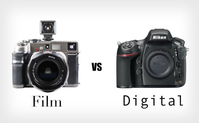
Before digital photography, we had different stages that lead to film photography. «KODAK MOMENTS» is something most of us has heard about. Which is moments caught on film. Film cameras need to be developed in a dark room or via a camera store that provides developments of your film. This process takes some time and…
-
CA – Strategic Design 1

I submitted my final design and report on thursday 1 of december, one day before the deadline. After intense work with the design for Fra Gård I just shut down a little while, so I didn’t post about it right away here on the blog. I could reveal right now that I have got the…
-
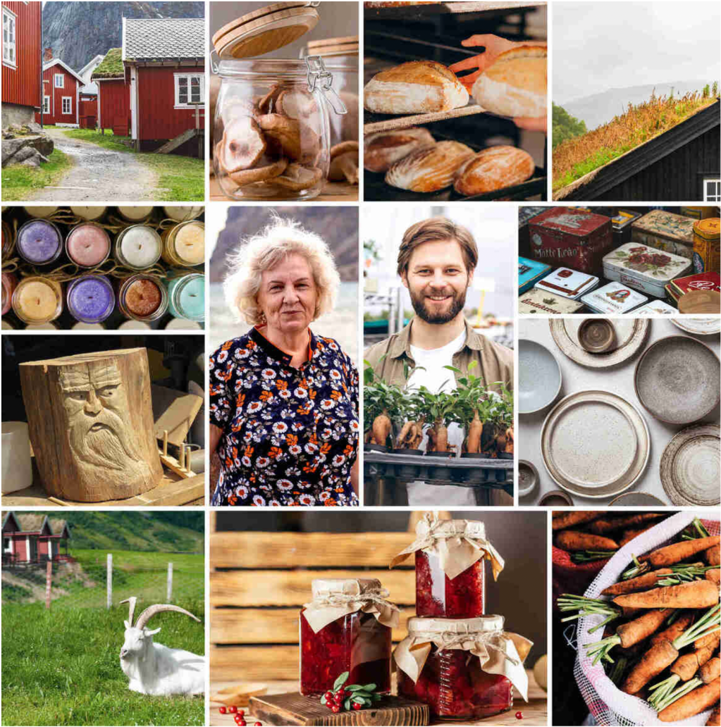
MA02 part 2 – Moodboard

I’ve created a moodboard with my CA brief in mind. I am developing a logo design for Fra Gård and this moodboard represents my inspiration for that logo design. First of I have included two types of typography, Merriweather in a light weight and Beloved Sans in a Regular weight. Both of these typefaces are…
-
MA01 part 4 – Brand Positioning Statement

After doing a lot of research and putting all my information in to buyer personas, I have been working on creating a brand position statement. A brand positioning statement creates a perception in the consumers mind about the product or service. It’s all about influencing the consumer in a certain way when it comes to…
-
MA01 – part 2 Strategic Design
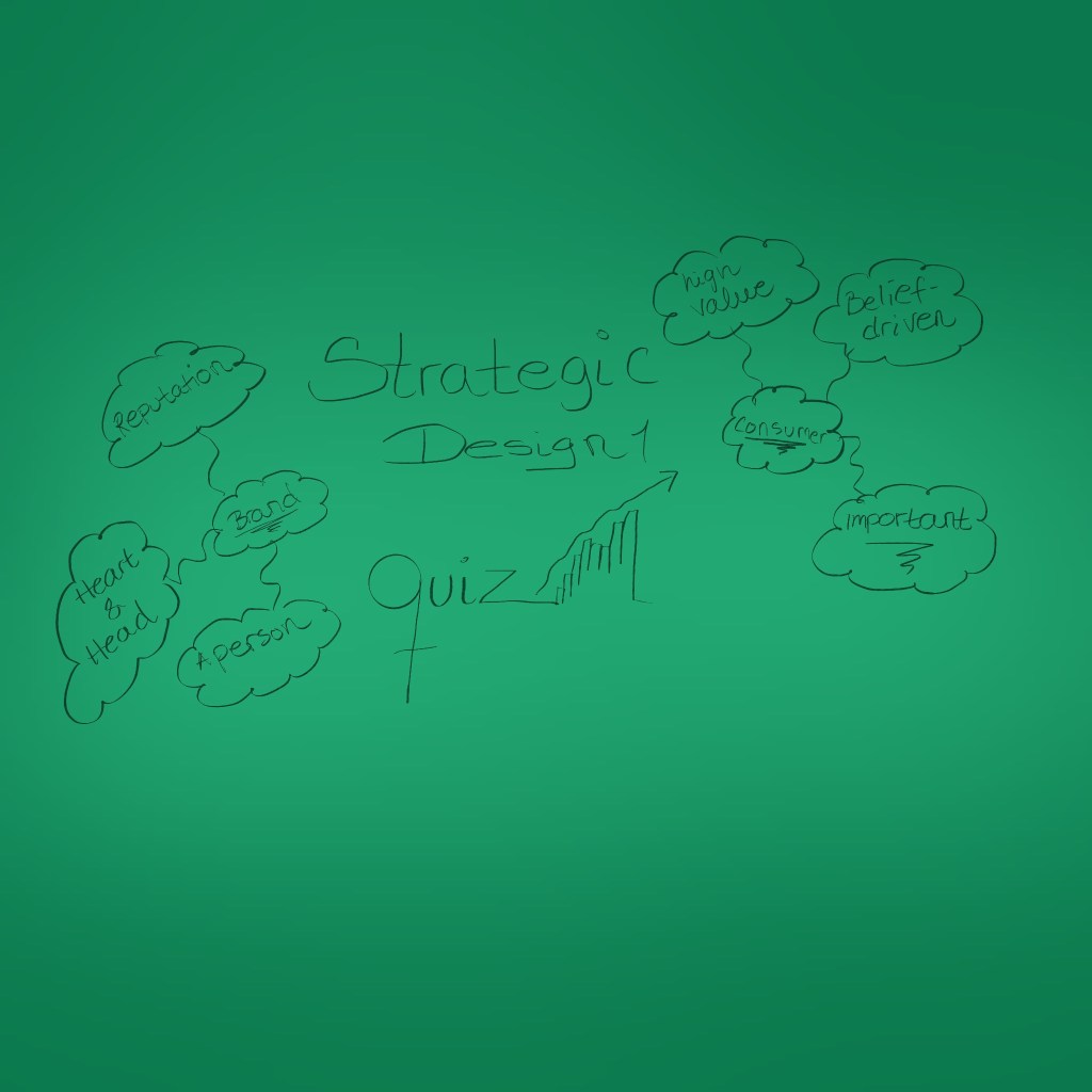
Completed a Quiz about strategic design and got all of them correct ✔️ – CDH 🤓
-
Strategic Design – Branding

The word «Brand» comes from the act of identifying livestock with a mark burnt onto the skin in the American Midwest. By branding their animals, farmers could easily see the animals who belong to them. In 1789, Andrew Pears «branded» his soap bars to make them stand out from other soaps from competitors. Then the…
-
MA01 – Part 1 Strategic Design
As part of my strategic planning and research, I need to write things down and answere some questions about the CA brief. This will help me solve the «problem» / brief in a creative and strategic way. How do we start with the strategic design process? We start by understanding why we are creating what…
-
CA1 – Book Cover Design

I have been working on this brief for several weeks, and used the two last weeks to finalize the book cover and my comprehensive report. The brief stated that a new book cover for «The Seven Dials Mystery» by Agatha Christie, should be made with a minimum number of colours, include the number 7 and…
-
MA03 – Adjustments Moodboard

I have made a new moodboard for my MA03, thats also a part of my big project that i’m working on. I wasn’t happy with some of the images in my mood board and I asked for some guidance on forum. I got some feedback and worked with my moodboard with my feedback in mind,…
-
MA03 – Mood Board
As part of my process of creating a new book cover for «The Seven Dials Mystery» by Agatha Cristie, I needed to develop a mood board to help me. After learning about typography, colour theory and the use of images – I could apply my new knowledge to this project. I used a lot of…
-
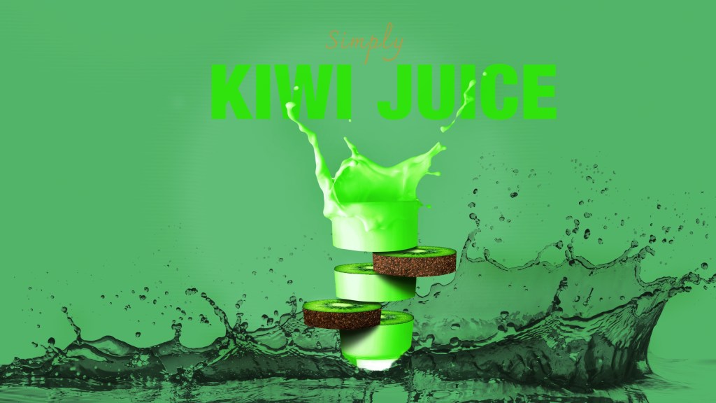
3.4(1&2) Fruit Juice Photo Manipulation Effect
This week I have been using a lot of time reading and studying about images, types of imagery and how to choose the right image. I then followed a learning video created by Tutvid about how to manipulate fruit juice photos. To practise my image sourcing skills, I used different images than in the learning…
-
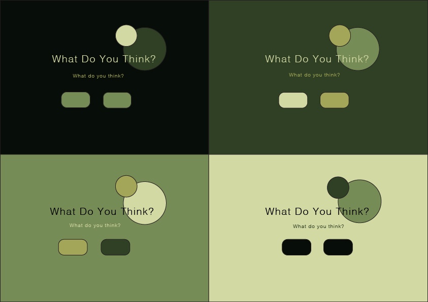
3.3 (2) Generate Two Different Colour Themes – Colour Theory
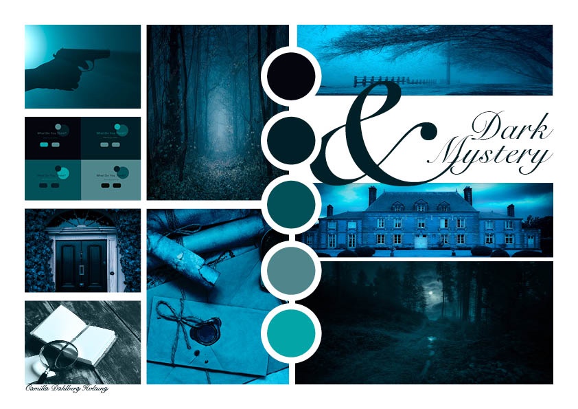
As part of my big project I need to create colour theme options for my mood board, which will help me in creating and developing a new book cover for «The Seven Dials Mystery». After reading, studying and working through the course in Adobe Color – I started doing a lot of research around mysterious…
-
3.3 (1) Colour Theory

In addition to learning a lot about typography the last two weeks, I have also learned a lot about colour theory. As a Graphic designer it’s really important to know about colour theory – which is a theoretical understanding of colour. I have learned a lot about how to make colour combinations by using colour…
-
3.2 Typography 2
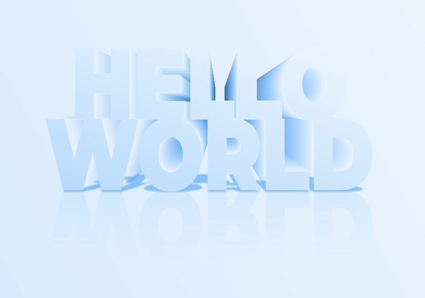
The last week I used a lot of time learning about typography, and how to manipulate text in Illustrator. The lecture videos looked easy and simple to follow, but I got a really hard time with the 3D effect lecture. I used two days to just figure it out, and that’s kind of embarrasing. However,…
-
3.1 Typography 1
One of the most important tools a graphic designer should master – is typography! As a designer we need to be able to use typography in a creative and custom way – know how to make adjustments so we enhance the readability, and make the reader intrigued. As a graphic designer you can also specialise…
-
2.4 (2) Celtic Cross

To learn more about shape builder tool and pathfinder tool I watched a lecture video and learned about the difference. Shape builder tool is the most effective tool in most cases, but pathfinder tool has it’s strengts in some areas where the shape builder tool is weaker. For this assignment I made a Celtic cross…
-
2.2 (1 & 2) Basic Shapes

It’s useful to understand how to create different shapes in Adobe Illustrator as a graphic designer, since they are the building blocks in all design. I first learned how to make different shapes from just a square, with direct selection tool and curve settings. I found it easy and fun to manipulate, creating various shapes…
-
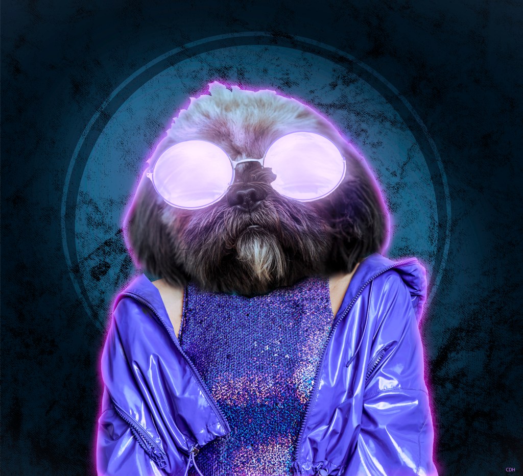
1.4(2) Animal Human Portrait
For this project I followed a tutorial on how to make an animal human portrait in Photoshop. I didn’t want to use the same pictures and textures as the man in the video, so I found something different. I might have given my self an extra challenge when I chose this fluffy dog: And this…
-
1.3(2) Engraved Texture
This is another Photoshop project I have been working on. For this composite I needed to first create a new texture from scratch. Started out with only 10 pixels width and 10 pixels height (8 bit) in greyscale and white background. Then, to create this I made one half of the white background black, and…
-
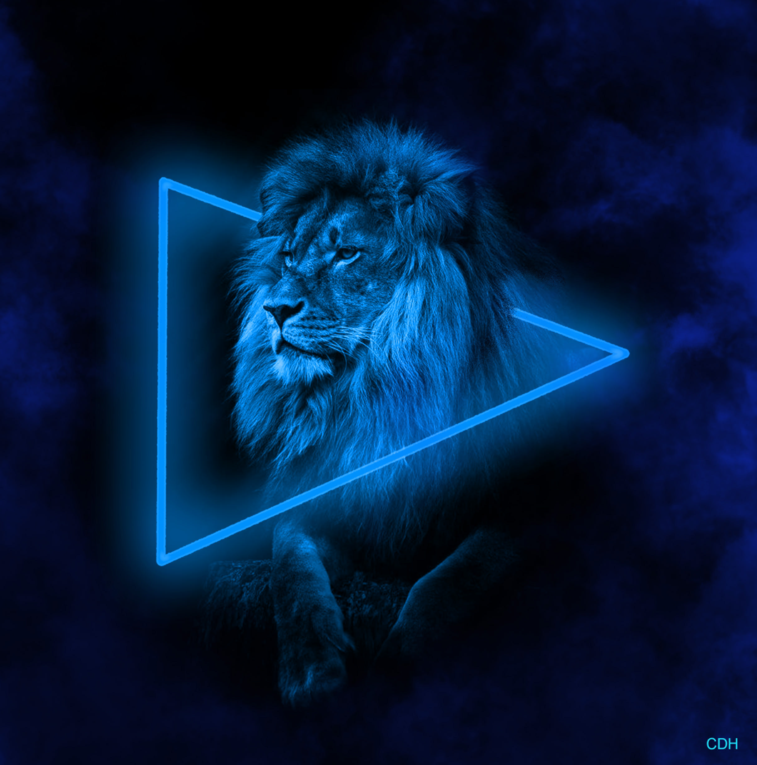
1.2.(2) Neon Light Effect
For this project I worked in Photoshop, using a black and white picture of a mighty lion. Aventually creating a neon light effect and smoke around the lion. I startet out with this picture: In the beginning I started with making the black background bigger. In order to have more workspace for the shape, neon…
-
1.1 Simple Composite In Photoshop
For this period I’m working on my Graphic design software skills. The main Graphic design softwares are: Photoshop, Illustrator and InDesign. For this task I used Photoshop, and multiple images and blended them together. I have no experience with Photoshop so this took me a while to figure out. After sitting with one project for…