Author: CDHGraphicDesign
-
MA02 – Using Ideation Techniques And Sketching

For this assignment I ended up with using two different ideation techniques, «Morphological analysis» and «Consequences». I need to come up with ideas for my course assignment, where I am creating a new book cover for «The Seven Dials Mystery» by Agatha Christie. As you can see in my morphological analysis I chose to work…
-
Activity – Ideation Practise

As just practise, I did a activity where you first draw scribbled shapes, random ones. Shapes that doesn’t make any sense. Then I tried to draw something familiar or some kind of drawing out of the random shapes. I then wanted to fill out everything so i added three more random shapes to work with:…
-
2.4 (2) Celtic Cross

To learn more about shape builder tool and pathfinder tool I watched a lecture video and learned about the difference. Shape builder tool is the most effective tool in most cases, but pathfinder tool has it’s strengts in some areas where the shape builder tool is weaker. For this assignment I made a Celtic cross…
-
2.4 (1) Sketching In Graphic Design
I just learned a LOT about ideation techniques and how to generate ideas in quantity and quality – sketching is a huge part of that and it is a key skill for all graphic designers. Sketching is an essential part of developing ideas before making them digital. Our brain works different when we are sketching.…
-
2.3 Idea Generation

This week I learned a lot about idea generation and different ideation techniques. Some of the ideation techniques I learned about: All of these methods are a big help in the process of designing. The first steps before making anything is always research and analysis, part of that is also the time you use to…
-
2.2 (1 & 2) Basic Shapes

It’s useful to understand how to create different shapes in Adobe Illustrator as a graphic designer, since they are the building blocks in all design. I first learned how to make different shapes from just a square, with direct selection tool and curve settings. I found it easy and fun to manipulate, creating various shapes…
-
2.1 (2) Dotted Spiral Vortex

To develop skills in Adobe Illustrator I started out with a turtorial on how to create a dotted spiral vortex. There weren’t too many steps and I found it easy as I understand how to «connect the dots» in what I am doing. With this one I realised at the end that I should have…
-
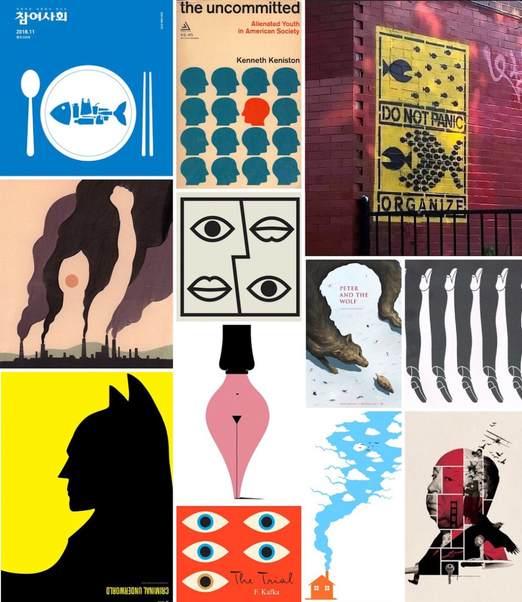
2.1(1) The History Of Modern Graphic Design

For this project I’m choosing a design that caught my eye as a book cover, which is influenced by one of the Graphic Design eras: Before I tell you more about the design and designer that I chose to write about. I want to write down some information about each era and some of the…
-
MA01 – Visual Interpretation

For this project my brief was to create a visual interpretation of the number 7 using Gestalt principles. The creations are made by hand, with paper, pencil, scissors and markers. I also used the nature as a background. I have shared the work on forum and asked for feedback from teachers and other students. I…
-
New Header
I tried to make a new header for my blog and reflective journal, with what I have learned so far! I hope to update it a long the way with new skills. I found it a bit hard to adjust the header in the wordpress menu – so i’ll have to work on that. However,…
-
1.4(2) Animal Human Portrait

For this project I followed a tutorial on how to make an animal human portrait in Photoshop. I didn’t want to use the same pictures and textures as the man in the video, so I found something different. I might have given my self an extra challenge when I chose this fluffy dog: And this…
-
1.4 Gestalt Principles
Gestalt is a psychology term founded on works by Max Werheimer, Wolfgang Köhler and Kurt Koffka in the 1920’s. Gestalt is a german word and means «form» interpreted as «configuration», a unified whole. «According to gestalt psychology, the whole is different from the sum of it’s parts» The hypothesis is that people tend to organize…
-
1.3(2) Engraved Texture
This is another Photoshop project I have been working on. For this composite I needed to first create a new texture from scratch. Started out with only 10 pixels width and 10 pixels height (8 bit) in greyscale and white background. Then, to create this I made one half of the white background black, and…
-
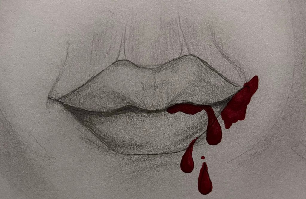
1.3(1) Fundamentals Of Graphic Design
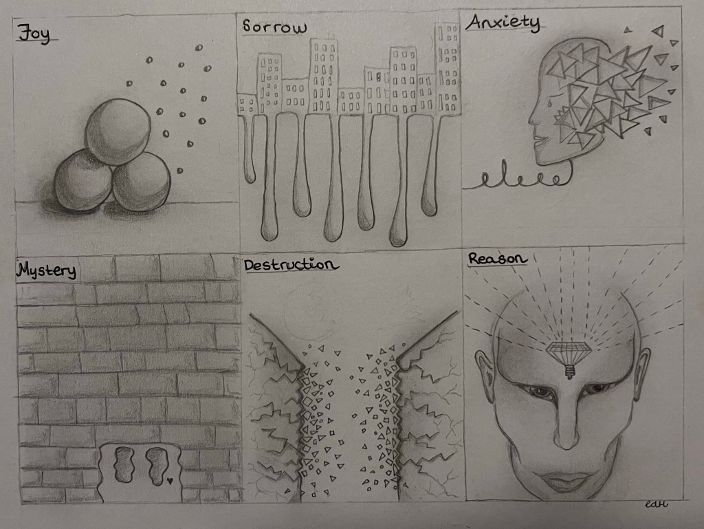
The main elements of art and design is line, shape, form, texture, balance and the rule of thirds. These elements are important to learn and master as a Graphic Designer. I made abstract depictions of the following terms: By only using elements of line, shape, form, texture and balance. It’s a rough sketching, only pencil…
-
1.2.(2) Neon Light Effect
For this project I worked in Photoshop, using a black and white picture of a mighty lion. Aventually creating a neon light effect and smoke around the lion. I startet out with this picture: In the beginning I started with making the black background bigger. In order to have more workspace for the shape, neon…
-
1.2 The User Is Central
In the module I’m working on I learn a lot about empathy and how important it is to put the user/consumers first when working with a brief. Everything around us is design, and it impacts us in different ways. Like our favourite coffee cup or the social media we are scrolling through. To be a…
-
1.1 Simple Composite In Photoshop
For this period I’m working on my Graphic design software skills. The main Graphic design softwares are: Photoshop, Illustrator and InDesign. For this task I used Photoshop, and multiple images and blended them together. I have no experience with Photoshop so this took me a while to figure out. After sitting with one project for…
-
«Confusing forest of information»
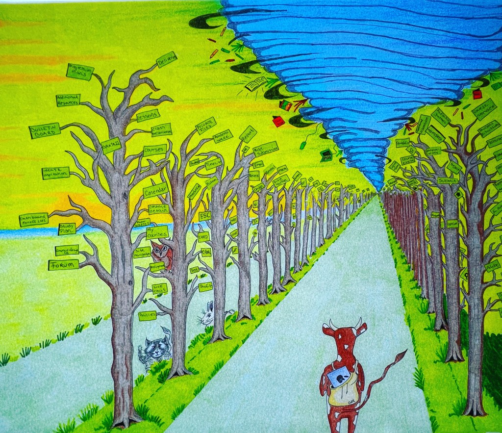
After having coloring problems and working through my issues I finally delivered my assignment before deadline. I’m kind of happy about the result, even though it’s not perfect. The illustration has it’s flaws, but this is my first delivery assignment and I think I learned a lot during the process, which is the whole point.…
-
Coloring problems
I’m at the scary part of my project, where I feel more insecure about my talents and choices. I Love colors and working with colors, but my strongest side when it comes to colors is when I use acrylic paint. I know how to blend and how to make it harmonic. For this project I…
-
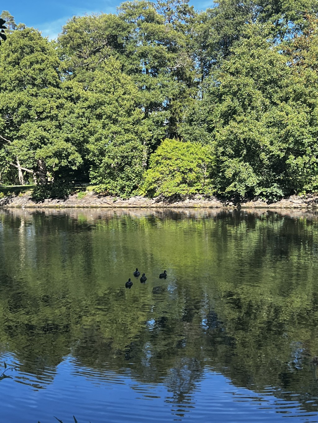
Interpretation Moodle platform

The project I’m working on now are really interesting and I found out that using the time to think and make a mind map helps a lot in the early stages of the process. I went outside with my son and he was swimming in the nearby lake, while I was working with just a…
-
Work schedule

To get organized I made a complete work schedule for the first and second semester. I felt this helped a lot, because it’s overwhelming with all the information at the beginning. For this post I also made a quick digital comic of me when I first opened the time schedule and managed to open the…
-
Introduction
Hi! My name is Camilla and I’m 32 years old. I´m studying to be a graphic designer at Noroff. At this site I want to publish my work and show my learning curve with reflective journals. I have no experience with graphic design going in to this study and I hope to learn and evolve…