Studying Graphic Design at Noroff. This is a place for my art. Where I publish my reflective journal, work and show my learning curve. Stay tuned.
CA – Graphic Design 2
These past weeks I have been learning about layout design, composition, guidlines, layout principles and so on.
It has been some intensive weeks, with a lot of tasks, assignments and an exciting CA brief.
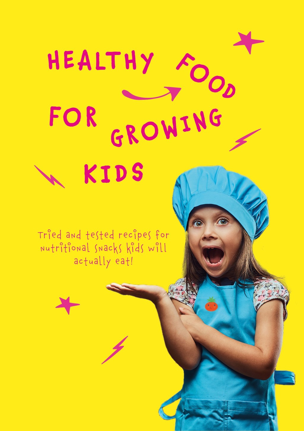
I have already written a god deal about this CA’s brief – however, the brief stated that a recipe booklet should be made with pages devisible by four. A5 format, in portrait or landscape. The name of the booklet: «Healthy Food For Growing Kids»
There was restrictions about format, margins, bleed – in addition to the provided resources that was mainly recipes, introduction and other elements. The «client» did not provide any visuals og guides when it came to the layout, colours, images or feel of the booklet other than that the target group is children and their parents.
I had a lot of creative playroom, and that was both challenging and fun.
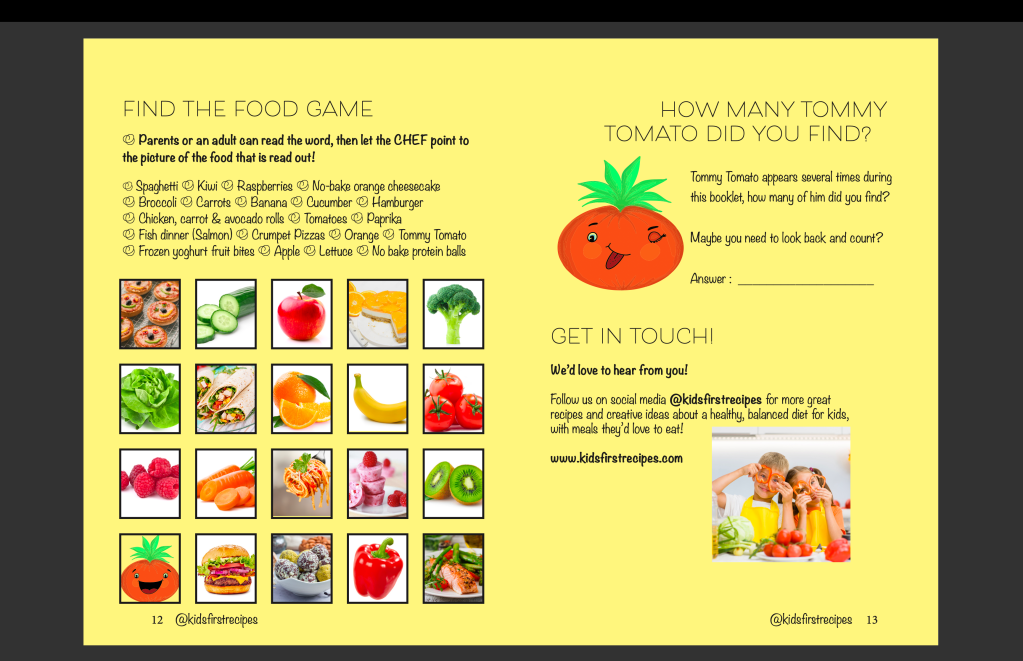
I ended up with designing a colourful, energetic and playful recipe booklet for children. I also added a «find the food game» and a counting quest for the cildren. Hopefully this will keep the child enganged and that it creates a bonding moment between the child and adult.
I have written a comprehensive report about my work process and how the design came to be, therefore I will not go in detail here on the blog.
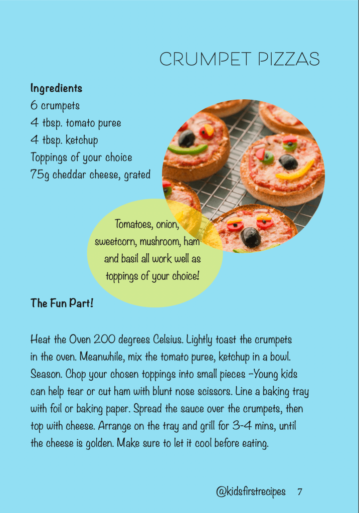
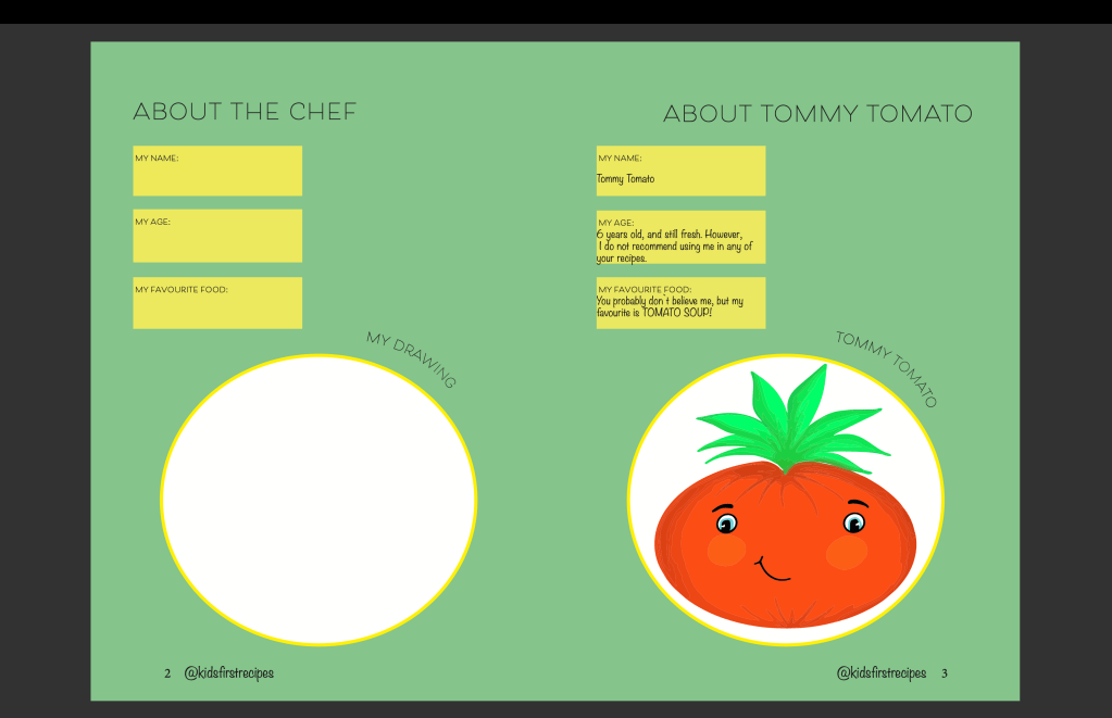
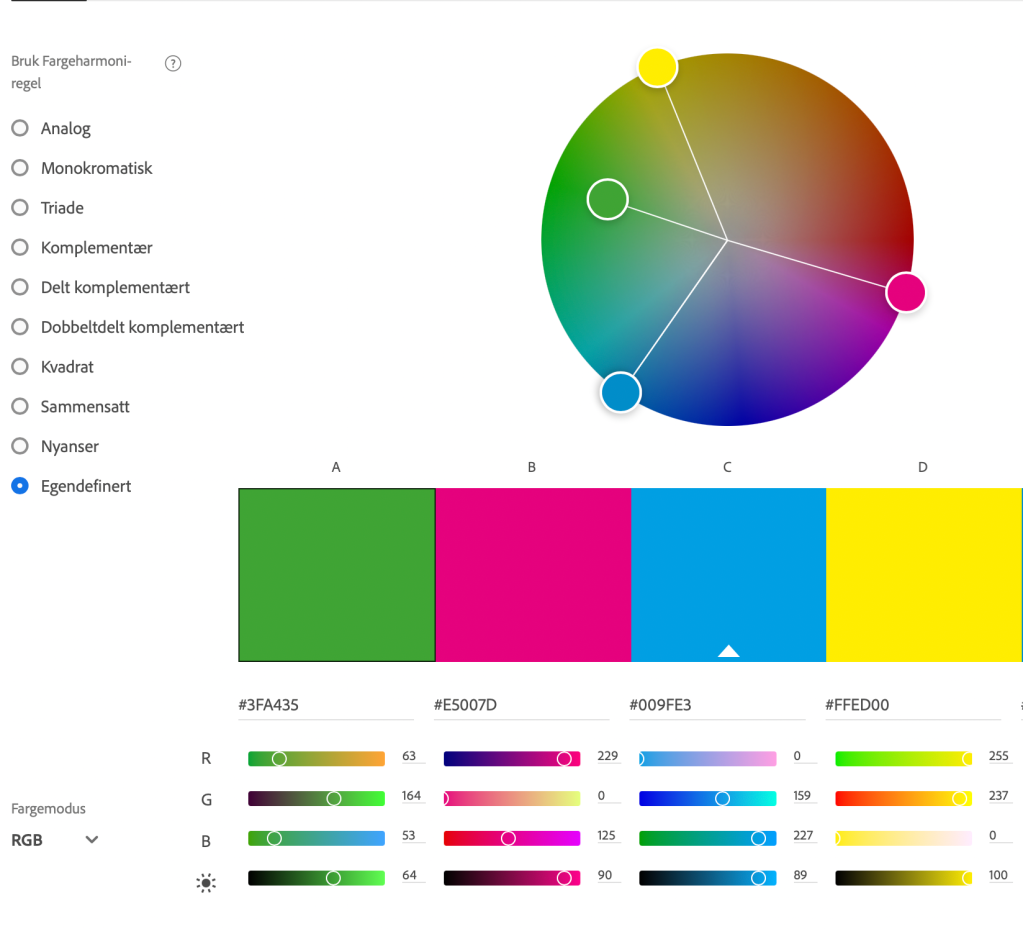
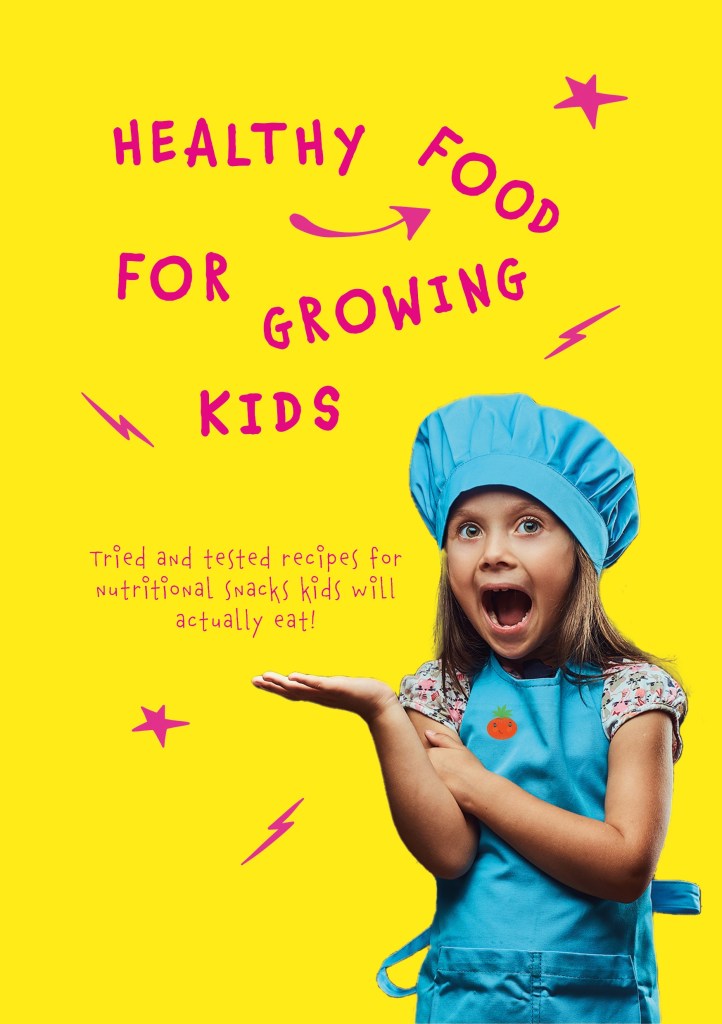
A screenshot of one of the pages in the booklet. As you can see I have chosen to mix different fonts to create an effect. Here I have used Beloved Sans in a regular weight and Noteworthy in a light weight. Noteworthy makes it all a bit more fun! All pages have different colours that emphasise the content on the page and keeps a energetic pace for the viewer. I also created a character called Tommy Tomato, he appears several times through the booklet. The first page also has a page for the child to write about him/her self and draw if they like. I created Tommy Tomato in Procreate by drawing digitally and then vectorized him in Illustrator. I created him with several face expressions, to make him more interesting! The two last pages of the book contains the game that I created and a Count Quest for the children. It also contains contact information and a web site for the client. Strategically placed on a page where the children wants to spend more time with, so that the parents would get the information. Cover and booklet in InDesign. Colour palette! Self defined, with high contrast colours in Adobe Color. I designed the bookcover in Photoshop, before I transferred it in to my InDesign file. The Photo of the girl are Licensed from Adobe Stock, I altered the Photo in Photoshop and then added the vibrant yellow background. Then I used Chauncy Pro from Adobe Fonts on the cover, to create a playful vibe. Furthermore, I created lightning , arrow and stars in procreate before I vectorized them in Illustrator. I then placed them strategically on the cover around the girl and the title, inside the margins.
I just delivered this product including a comprehensive report about my work process, 3 days before deadline.


Leave a comment