It’s truly important to master the art of communicating ideas and messages in the best possible way as a graphic designer.
To be able to grab the attention of people living in a world of visual stimuli.
That’s where layout and composition plays a big part. Layout design is a fundamental part of visual communication.
It’s not only about attractivly arranging text and visuals, it’s also important to know about the composition principles:
- Balance
- Consistensy
- Contrast
- Proximity
- Repetition
- White space
These principles should be used in a layout to make sure that the viewer understands the message.
What makes a good layout?
The first step in a layout is to grab attention. It also needs to provide a clear and effective message that is easy to understand. The layout should add to the story to enhance the meaning. Dynamic and engaging instead of dull and confusing.
I tried to find a page layout in one of my books that I found inspiring, I then realised that most of my books are heavy to read and not at all that inspiring actually. Most of them are vintage books that looks very good on the cover, however the text and page layout are heavy and not that inspiring. So I went on to the web, searching for a layout that I found inspiring.

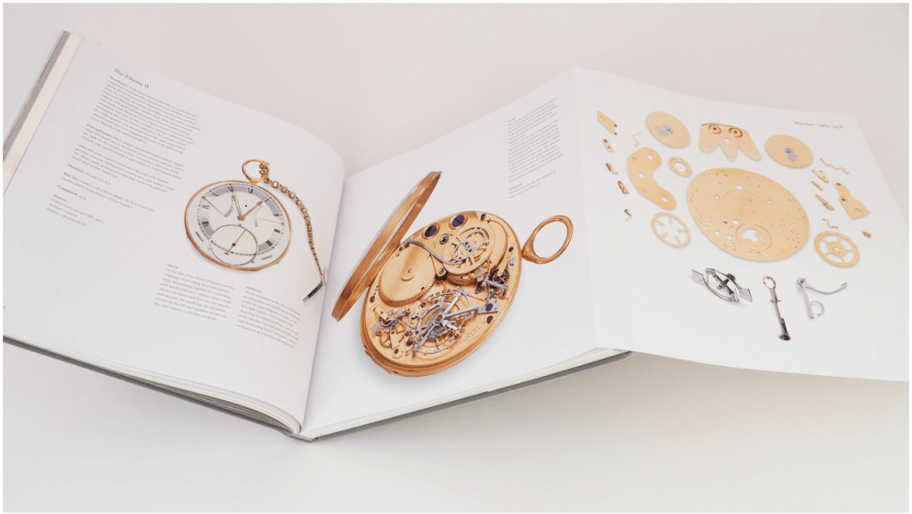
This page layout is sucessfull because of the use of visuals like the clock, outside, inside and parts. It has really well placed graphics. It also contains a good amount of white space, that emphasise the graphics. The relationship between the elements show proximity in a good way. There is contrast in the visuals and to the background that makes the graphics «pop» on the page.
The design also shows consistensy by its way in telling the story of the clock and the clocks anatomy. I love how the text is simple and have white space around it, making the graphic of the clock the star of the design. The special part of the design is the extra page that you can fold out, it’s a smart design.

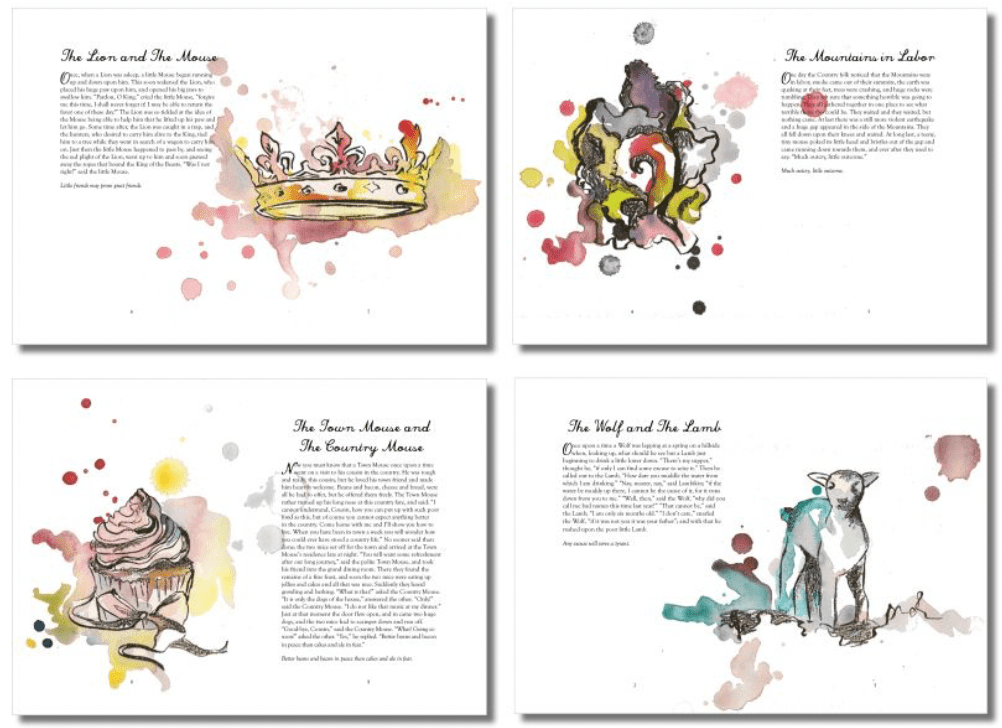
I also came across this page layout that I really enjoyed. It has balance with the style of the drawings/ graphics. They are in the same style, however shows different colours with different elements (contrast). The graphics tells a story with a beautiful serif handwritten header for each section. The layout design shows consistensy in the design with drawing and watercolour effect, as well as the font.
It also have the perfect amount of white space around the graphics and the text. Proximity is applied with the relationship between the elements.
This page layout design really inspired me for my next CA work!
1.1 part 2
Looking at the physical world around me, I can draw inspiration too. It’s a bit more abstract and difficult to see how, but I can see different elements that inspire me when it comes to the current brief I am working on.
Capturing the excitememt and joy that children can experience when they are allowed to cook in the kitchen. Just be able to make a mess, taste and create.
I have been watching my own son in the kitchen as he has grown up with me allowing him to experiment in the kitchen. And the joy I have witnessed is far more important than all the cleanup work afterwards.
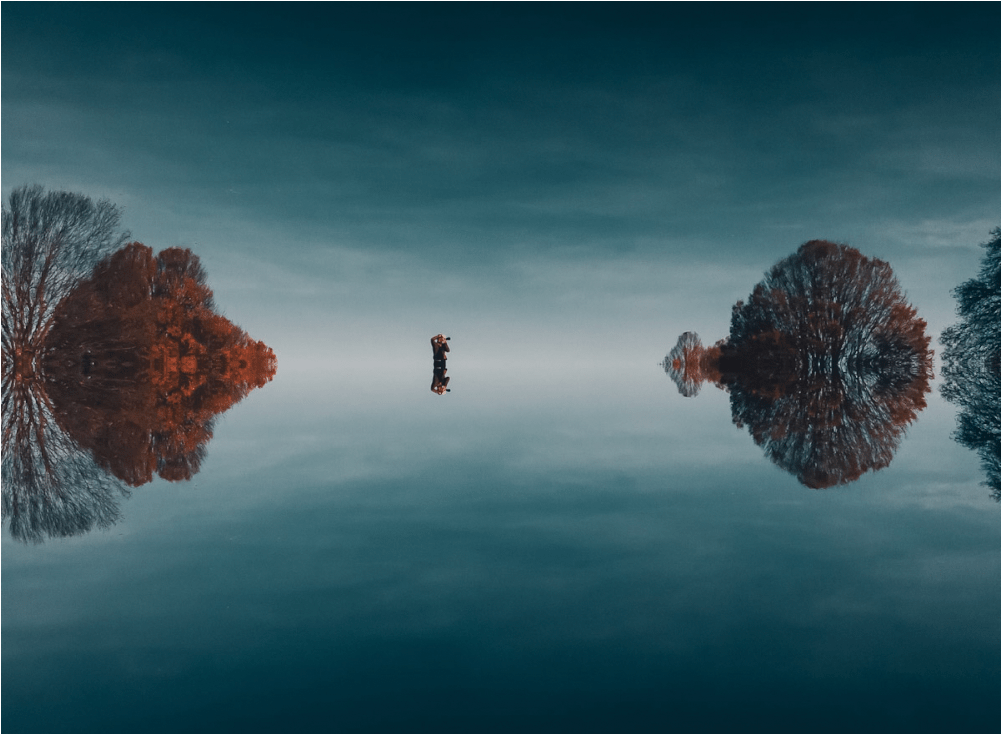
I have also drawn inspiration from nature, as I always do. The colours of nature is often vibrant and something we feel familiar at the same time. As seen in the two pictures below:


I’m really looking forward to use this inspiration when creating a recipe booklet for parents and young children, «Healthy Food For Growing Kids».
Leave a comment