
I submitted my final design and report on thursday 1 of december, one day before the deadline.
After intense work with the design for Fra Gård I just shut down a little while, so I didn’t post about it right away here on the blog.
I could reveal right now that I have got the feedback already on this one and I passed, luckily!
Also I was surprised by the good feedback I got about my work. Just some minor tweaks on the feedback, but the first sentence I read was «your consept is clever, relevant and unique. Well done» and that made me so happy!
Enough about me telling you about my feedback and how happy I am about that, let’s talk about my final design and how I solwed the brief.
As you can read from my prievious post’s with my MA’s (stands for module assignments). I have been working a long time around Fra Gård’s branding, target market/ groups, byer personas, brand positioning statement and brand archetype.
All of that research went in to the whole process of developing and design a logo for Fra Gård, and it’s also included in my comprehensive report.
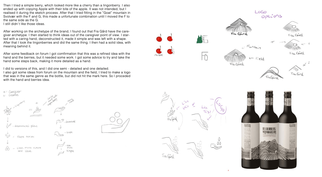
After a lot of rough sketching I landed on a idea with the lingonberries from grandma’s lingonberry jam and a caring/ giving hand. I tried many options with simple ones and more hand drawn personal ones. I used a gestalt principle in the logo, called pragnanz (familiarity). In this case the hand with the berries shapes like a triangel which is a familiar and pleasant shape for us to see.

Small changes and fine tuning a design is vital to create a really good design, and that applies to all the work a Graphic designer does. If you think you are done, you probably have several hours left of work before you are really done!
Very often when I start to feel happy about a design i’m making – I now know (versus what I didn’t know in the beginning) that I am far from done. Graphic design isn’t easy, it’s really hard work and as I am progressing through my studies I gain more and more respect for every little detail on the cover of a book, the posters I see, logo’s I look at and everywhere I find something a Graphic designer used a lot of hours creating and I think «wow, I didn’t know or even think about it before»
A little sidetrack there, about my admiration for other Graphic designers and my eye-opening journey!
My final design for Fra Gård:

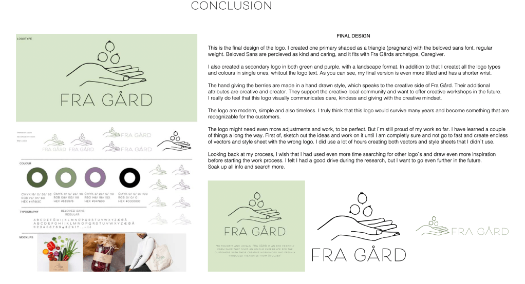

I Wish I could show the logo in all the different shapes and in vector here, but the only way to thow them is with screenshots and JPG files. Sadly, the quality and purpose of the logo is not show’n in their best way.
For those who read this and do not know what a vector is, short explanation:
Vector is an image that is not pixaleted. You can zoome in and scale it up and down infinatly without loosing the quality. You do not get the box pixels that often come when you zoome in on a raster image.
Raster on the other hand is a pixelated image with pixels that you can not scale up and down as much as you like.
I could have explained that even more, but I think that covers it.
I made the vectors for my logo first with procreate on ipad. A drew the hand and the berries by hand with my Ipen, and then I transferred my drawings over to my Mac and in to Illustrator. Where I converted my drawing in to an vector. From there I choose different colours and sizes of my vector.
So that is that, over all I learned a lot and feel happy about my end result with the design.
Best regards, CDH

Leave a comment