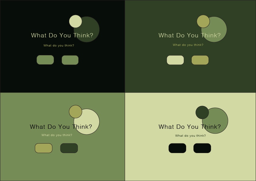
As part of my big project I need to create colour theme options for my mood board, which will help me in creating and developing a new book cover for «The Seven Dials Mystery».
After reading, studying and working through the course in Adobe Color – I started doing a lot of research around mysterious colours.
«What kind of colours do we get a mysterious vibe from?»
I used the website Cymbolism to check out association between the word «Mystery» and colours. I went through a lot material in Adobe Color in the explore section to find stock images with palettes that inspired me. Also I worked a long time with adjusting og trying out different palettes.
After much trying and adjusting I found my two candidates for my mood board (MA03) and colour theme for my book cover assignment.


– CDH
Leave a comment