The last week I used a lot of time learning about typography, and how to manipulate text in Illustrator.
The lecture videos looked easy and simple to follow, but I got a really hard time with the 3D effect lecture. I used two days to just figure it out, and that’s kind of embarrasing.
However, i’m proud of my self for not giving up. I must have watched that video 50 times and ripped out hairs from my head. But, I made it!
I can’t tell you that this was fun for me, because it wasn’t. This was challenging and frustrating, and when you look at my finished products you probably think
«uhm, this looks easy».
Well, everyone has their own places where we excell and places in the studies we struggle with.

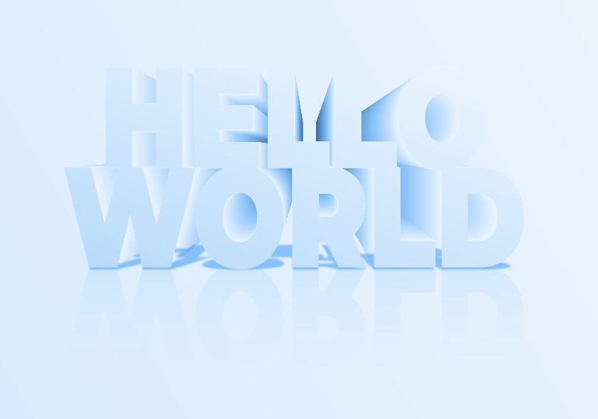

I’m so happy to have finally made these, and the one i’m most happy with is also the one I worked hard on and had a lot of greif with. So hard work pays of!
Best regards, CDH

Leave a comment