
For this project I’m choosing a design that caught my eye as a book cover, which is influenced by one of the Graphic Design eras:
- Art Nouveau
- Bauhaus
- Art Deco
- Swiss Design
- Pop Art
- Postmodernism
Before I tell you more about the design and designer that I chose to write about. I want to write down some information about each era and some of the history of how graphic design came about as we know it to this day.
It’s important to know and understand the history of Graphic Design to be able to see key design trends of the past and how to shape them, as a designer, in the future.
William Addison Dwiggins invented the term «Graphic design» in 1922 to describe his process of designing books. He combined illustration, design and typesetting. Book design changed from being a simple craft to an interpretive art.
The whole idea of «seeing is as important as reading» came to life. Typography and illustration can be used for symbolism.
Graphic design has been here long before someone named it, and we can see designs in caves dated way back.
Art Nouveau
Design style that originated from 1890’s. The main idea and style were art based on natural shapes. It was a reaction against mechanism and industrial revolution in society.
One of the distinguishing features for Art Nouveau is the use of curved lines, which mimicked shapes of flowers and plants. Organic, asymmetrical linework instead of mechanical rigid shapes.
Bauhaus
Few things has influenced modern architecture, art and design like the bauhaus school in Germany (founded in 1919), with their motto:
«form follows function» – which means focus on functional simplicity.
Nothing is used without a functional meaning, which led to an increased focus on geometric shapes, minimalism, simple typography, grids and proportions.
Art Deco
Art deco design movement originated from Paris and started around 1925. It had more focus on decor and mass production than on the functionality. Which lead to a lot of symmetrical and rectangular forms. Simple shapes as well as stylised geometric ornamentation. Often made in expensive materials and textures like ivory, marble, bronze and ebony.
Swiss design
«The international typography style»
Swiss design is all about the functionality and universality in design. Much like Bauhaus.
Logical, modular grid systems provided a framework to align different elements. This is now considered essential in Graphic design.
Realistic photographs with neutral sans-serif typefaces could be used instead of elaborate illustrations. Swiss design is minimalistic and minimalism has made a huge comeback in modern design. Especially in logos, with clean subtle aesthetics.
Pop Art
Pop art movement glorified popular culture. The designers got inspired by hollywood movies, product packaging, advertisement, music and comic books. Pop art represents something colourful, wild and absolutely not mundane.
Postmodernism
Postmodernism evolved from scepticism and questioning of reason, as a reaction against modernism.
Postmodernism embraced complex layers of meaning. Designers «broke the rules» by creating freely with collage, distortion, vibrant colours and abstract type.
Every era and movement shaped the Graphic design industry and how we visually communicate.
Graphic design is still changing fast. As designers we need to be curious, evolve and stay updated on latest trends.
Design analysis
For this project I searched the web for different designers and their inspirational work.
In the end I landed on this book cover designed by Chip Kidd, a legendary Graphic designer:
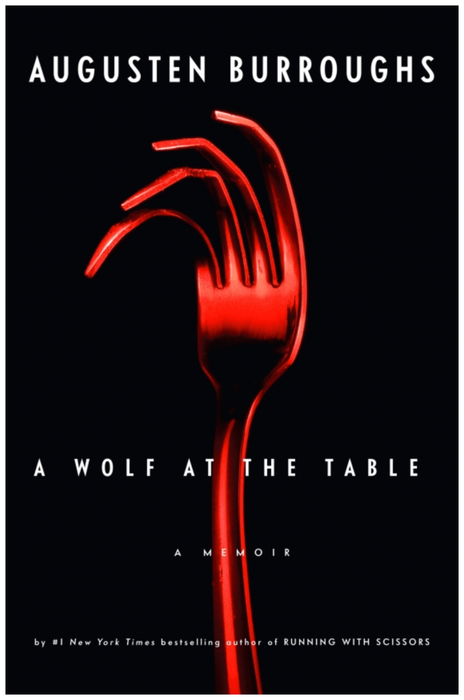
Chip Kidd designed this book cover in 2007 / 2008. The book got realised in 2008. It’s a memoir of Augusten Burroughs, about his turbulent childhood relationship with his father. The book went on to spend six weeks on The New York Times best seller list.

Chip Kidd is an American Graphic designer, author and editor. Born 12. september 1964 in Pennsylvania. He is mostly known as one of the most influential graphic designers of our lifetime.
Kidd has freelanced for various firms and produced over 70 book covers a year. Some of the publishing houses he freelanced for: Farrar Straus & Giroux, Amazon, HarperCollins, Scribner and Penguin/Putnam.
He is also a huge admirer of comic books and he has not only written some for DC comics, he has also designed many of their covers. He has a long list of impressive work behind him, and he is really a legend when it comes to graphic design. So inspiring to learn more about him, and look through his portfolio.
This book cover chaught my eye in a powerful way. This is a simple design, but effective and functional. I can see Bauhaus and Swiss design in this book cover in how Kidd just choose few colours, and a simple design with the fork. The fork tells a story and it is linked to the title of the book. Functional.
The typography used in the design of the book cover I would say is «Sans». Sans typefaces lack any embellishment on the ends of letterforms and are percieved as simple.
Sans can have letters that are thick, thin, short or tall, fat or condensed. In this book cover the typography is thin and big, sleek.
I love the way the fork is placed in between typography, like you can’t tell if the fork is behind or in front. It’s some gestalt principles at work here, law of continuation for sure.
The design and style that Kidd has made with this book cover back in 2008 is still relevant to this day. Simplicity and functionality are a huge part of modern design, and we see them among the trends in posters, magazines, book covers and especially logos.
This design inspired me a lot by it’s way of telling a story in a simple and effective way. That you can give so much information, with just a fork?!
I want to implement that into my own work. The ability to tell a story with simple subtle designs, in an effective way.
I will use this inspiration in my big project where I’m working on creating a new book cover.
Credits for the book cover: made by Chip Kidd, found in his Portfolio.
Link: https://chipkidd.com/home/portfolio/
Best regards, CDH

Leave a comment