Gestalt is a psychology term founded on works by Max Werheimer, Wolfgang Köhler and Kurt Koffka in the 1920’s.
Gestalt is a german word and means «form» interpreted as «configuration», a unified whole.
«According to gestalt psychology, the whole is different from the sum of it’s parts»
The hypothesis is that people tend to organize visual elements into groups og «unified wholes» when certain principles are applied.
General rules of Gestalt theory
- Objects will be percieved in their simplest form.
- Humans naturally follow lines or curves.
- The human mind will attempt to fill in detail that isn’t actually there.
As a Graphic designer it is important that we understand how people will percieve the designs we create to effectively communicate our designs message.
We need to understand the psychology of the viewers, to know how they will resonate with our creations.
There are several principles that defines Gestalt theory, the main six principles:
- Similarity (law of similarity) – Objects with shared visual characteristics are automatically percieved as being related.
- Proximity (law of proximity) – Objects placed close together are percieved as a group.
- Closure (law of closure) – Our eyes see incomplete shapes as complete. This is linked to law of continuity.
- Continuation (law of continuity) – Once our eyes begin to follow a line, they will follow that direction until they reach another object.
- Symmetry (law of symmetry) – Humans enjoy a sense of balance and order in designs. Symmetrical balance evokes feelings of stability and trust.
- Figure/ground (principle of perception) – We automatically understand the difference between an object and the surrounding space.
We also have:
- Prägnanz – simplicity and familiarity: People intuitively prefer the simples solution possible and search for familiar objects. We often see familiar objects first.
- Law of common fate – objects functioning or moving in the same direction appear to be together, and we percieve them as a unit.


- Proximity: objects who are close together on the plate makes it look like a fish.
- Closure: the fish is incomplete or made out of incomplete parts. We see it as a fish (complete)
- Similarity: The blue colour that all the parts of the fish has, makes it easier for us to look at as a group and make it out to be a fish.
- Figure/ ground: it’s easy to see the plate and utencils, and separate it from the surroundings.
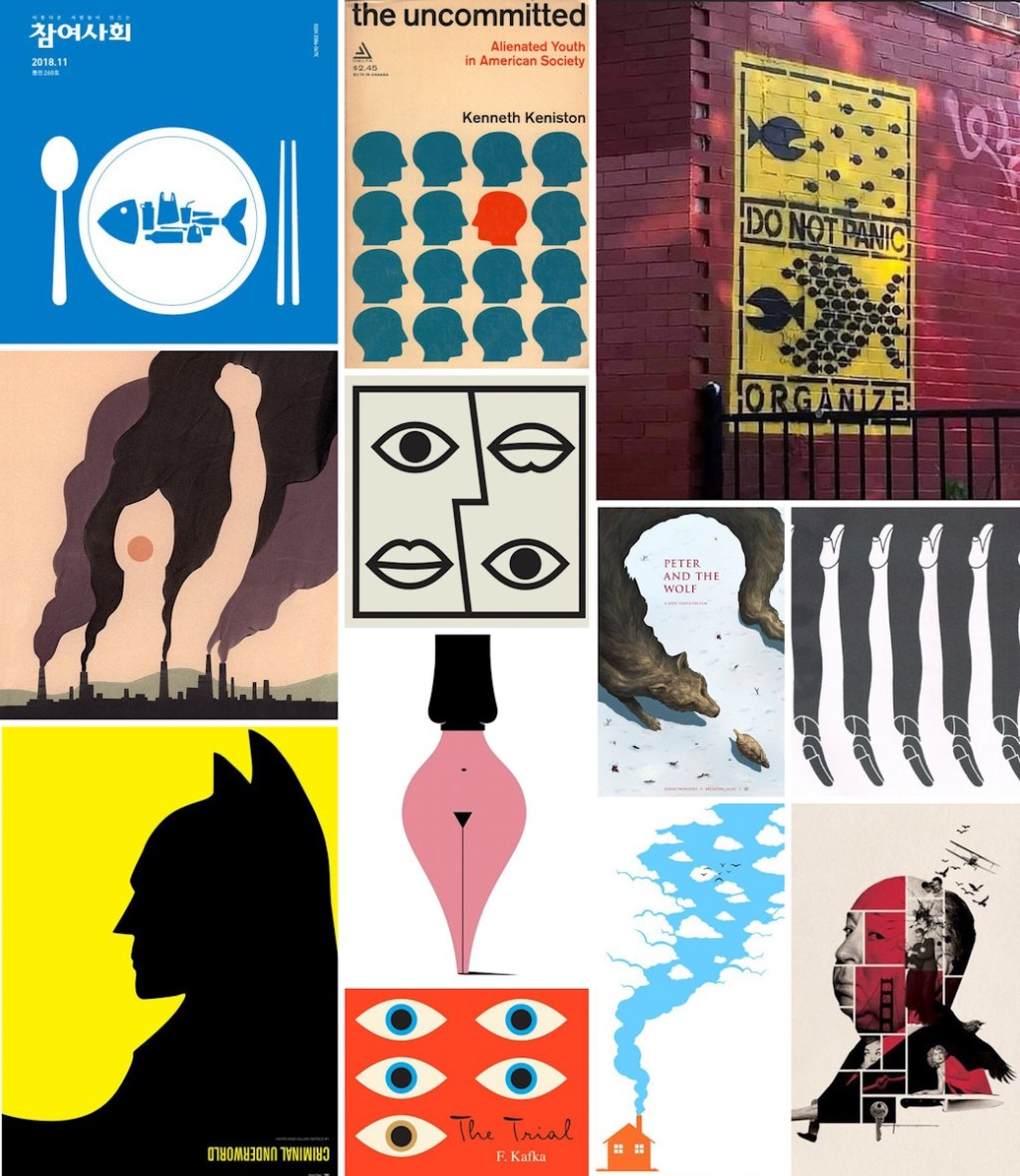
- Similarity: shape and colour of the heads.
- Similarity with anomally: the red head is an anomally in the group of blue heads, and makes it a focal point. This red colour of the head also makes the viewer more attentive to the red text above, since they have similarity. Which is a good choice to effectively describe the content.

- Law of common fate: the fish appears to be swimming in the same direction which created movement and them looking like a group.
- Similarity: same shape and colour, group.
- Proximity: the fish are placed close together so they look like a bigger fish, they make out as a group and a bigger object.
- Continuity: the lines around the text have pauses, but we follow the line and see it as a full line.
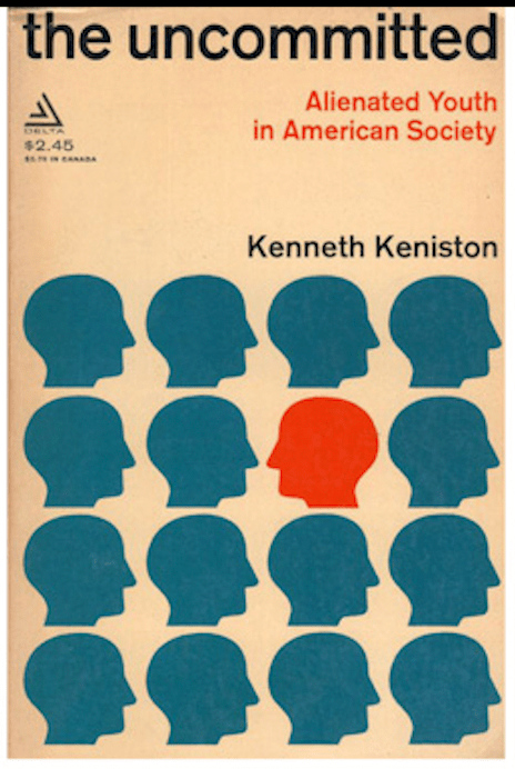
- Proximity: the smoke from the fabric are close together and make out another picture of a woman holding her hand up, looks like she is fighting for something. Maybe green choices.
- Closure: even though the woman isn’t drawn and complete, we see her incomplete shapes as complete.
- Figure/ground: we can easily separate the woman from the surroundings.

- Similarity: the image contains same characteristics with two eyes and two mouths. Two identical faces turned against each other, one upside down.
- Symmetry (?): I’m a bit unsure if this is symmetry, but the image represents balance and equal sides like yinyang. There is some difference of course because the eyes and mouth is not in the same place.

- Closure: the animal’s position and texture makes out the boy. Even though the boy is incomplete, we see the boy as complete.
- Figure/ground: We see the boy clearly from his surroundings.
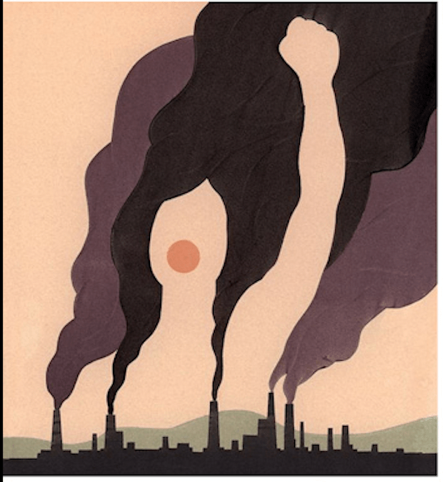
- Closure: we make out the shape of the legs by using information from the surrounding objects/ other legs. Incomplete shapes.
- Similarity: the woman and the gentlemen’s legs are similar and makes it out to be a group of legs in a row.
- Proximity: they are located closely together and we percieve them as a group.

- Figure/ground: The figure is batman and the yellow is the ground. We can easily separate batman from hos surroundings.
- Closure: The shape of batman makes the shape of his enemy in the yellow, the penguin. We se them both as complete.

- Symmetry: we see that the woman shape/ vase has equal sides and represents harmony.
- Prägnanz: i’m not 100% sure, but it might be prägnanz as well. Because the complex visual information are simplified in a search for something familiar – like a womans body and a vase.
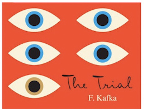
- Similarity with anomally: the blue eyes are similar and are percieved as a group, and the brown eye is an anomally which makes it a focal point. The rule of thirds is also applied here, because they managed to get the focal point on the left side, where the eyes search first.
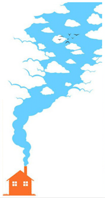
- Law of common fate: the smoke appears to rise up and travel the same direction. Which make it a group.
- Proximity: birds are painted closely together which is percieved as a group of birds in the sky.

- Closure: the man consists of multiple images/ objects placed close to each other to form a man. It looks complete, even though it’s incomplete.
- Proximity: images and objects close together to make a visual group, belonging together.
- Similarity: some of the images and objects show similarity by the colour red.
- Continuity: the lines of the man are broken, but we still follow the lines and see the man.
It’s not easy trying to find every principle used in these images, but it is good practice.
I also searched for a book cover where I could find some gestalt principles being used in the design.

I found this book cover, «Placeres». In this cover i found:
- Closure: the woman on the cover isn’t complete and there is negative space. We still see the shape of the lady in a delicate and interesting way.
- Similarity: the texture that the designer used is brick and in the same colour, with minor differences. It makes us percieve the woman even more as complete, because of the similarity in colour and texture.
- Figure/ground: we see the woman clearly from her surroundings.
Small detail of the cover is the door inside her texture, and the line that goes from her neck, looking like a necklace with a key. As a viewer I started to think that this key might open the door.
The cover has harmony and balance, and the little middlepart of her body might be a symmetry effect with the straight line. Although the sides aren’t equal, so I’m not sure.
Thank you for reading this long post about gestalt principles, I write it as a reflective journal for me to learn and look back at if I need to fresh up on my knowledge.
Best regards, CDH

Leave a comment