This is another Photoshop project I have been working on.
For this composite I needed to first create a new texture from scratch. Started out with only 10 pixels width and 10 pixels height (8 bit) in greyscale and white background.
Then, to create this I made one half of the white background black, and then used box blurr filter to make it go from light grey to black. I saved this pattern.
After that I got my new pattern in to my new file with 6000 x 6000 pixels. I went on to distort and added wave filter to make the texture I wanted.
Then I copied that layer and rotated it 90% to make the waves cross. After that I was done with making my new texture and I went on with my image.
First I started out with a self portrait, and the image was a mobile picture, not really god raw material. So I decided go for another picture and do some fixing before continuing with the lecture video.

I know that in the lecture video they used a portrait with a lot of face details, and it looked really good. So as I went along I realized I would get a totally different outcome. But the important part was that I followed the video and learned a lot. Even though my result looks quite different.
I decided to just go a bit nuts with my editing and started out with getting the woman out of her surroundings. Then I duplicated her three times in different sizes and placed them in a row. I made two types: one where the background was white and one with grey background. Just to see the difference along the way. I needed to experiment.
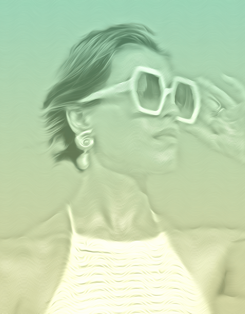
Then I continued with my «home made» texture and layed it on top of the image, I then blended it in by using «hard mix». The image instantly looked drawn.
After that I added oil paint filter, then shadow and highlight adjustments. I copied that layer and went on with adding oil paint filter several times. In order to not lose any details, I went on to make a mask where I could paint over certain parts with black. We do this to make details from the first layer stand out again.
The creation of this image required several steps. After adding the levels, opacity adjustments and fill adjustments, I made a graidient colour layer. Since I made two examples with different start backgrounds I started to see how that effected the images. So I decided to go for two different colours.
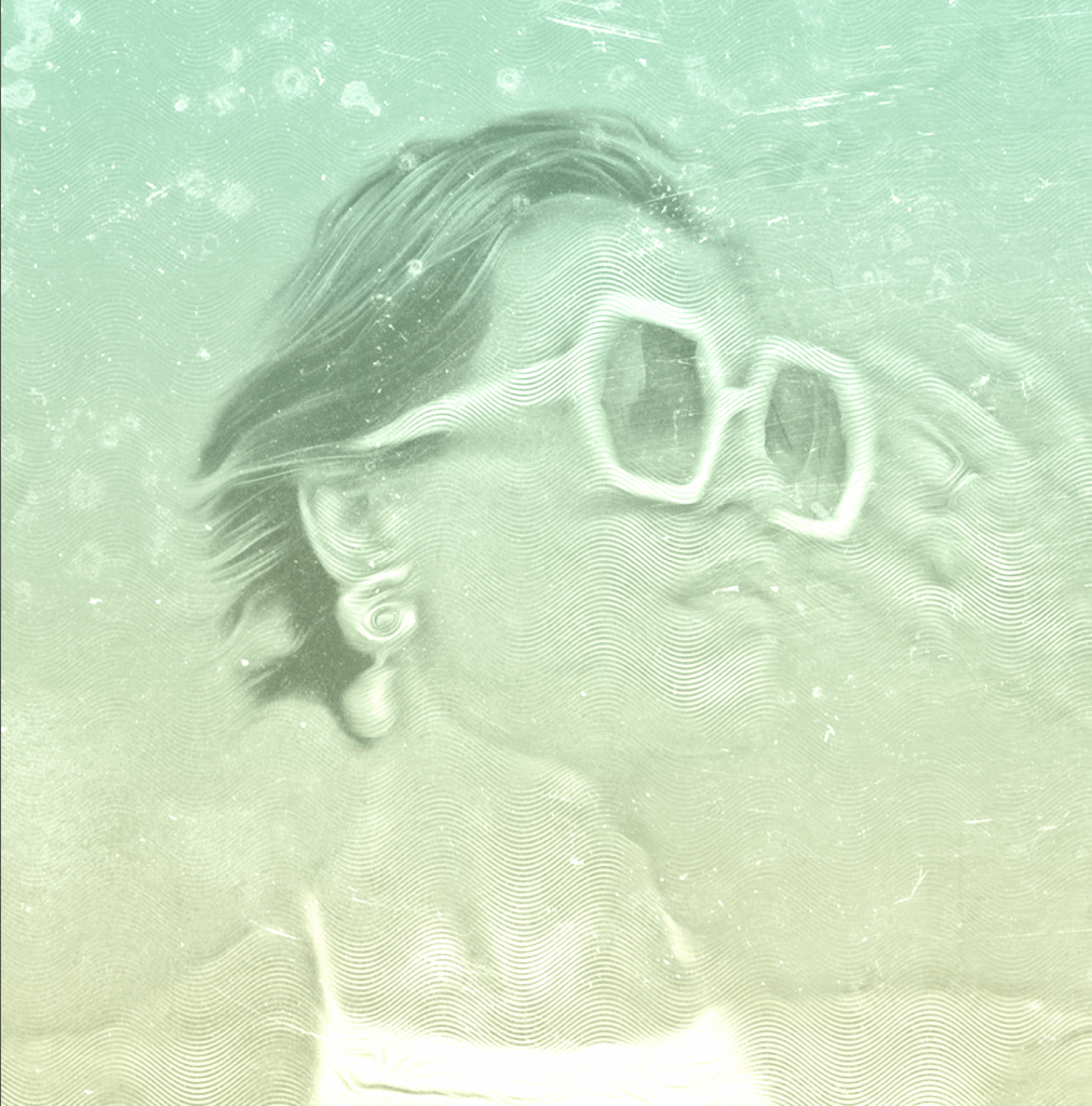
One of them in a green/yellow graidient, soft. The other one in more vibrant colours with light blue/ purple gradient.
I then tuned the opacity level on the colours to make it blend nice with the image. I went on to adding another layer of texture, using vintage texture. Then I made the sun rays from scratch in another file – then added it to my image.
I needed to adjust to make it right in the center, and adjustments where made with both opacity and fill level.
The weird thing is that I felt like this was such a huge and hard job, but after a while I knew the whole rutine without looking at my notes. I can make every detail twice as fast as when I first started this project. It’s so good to be feeling more comfortable and even though the end result isn’t nearly perfect yet – I’m still happy with my effort and learning curve.
Close-up pictures during the process

End Result
My end result has two images made with the same steps. They are different because of the background I started out with and the colours I made a long the way, other than that they got almost the same treatment.
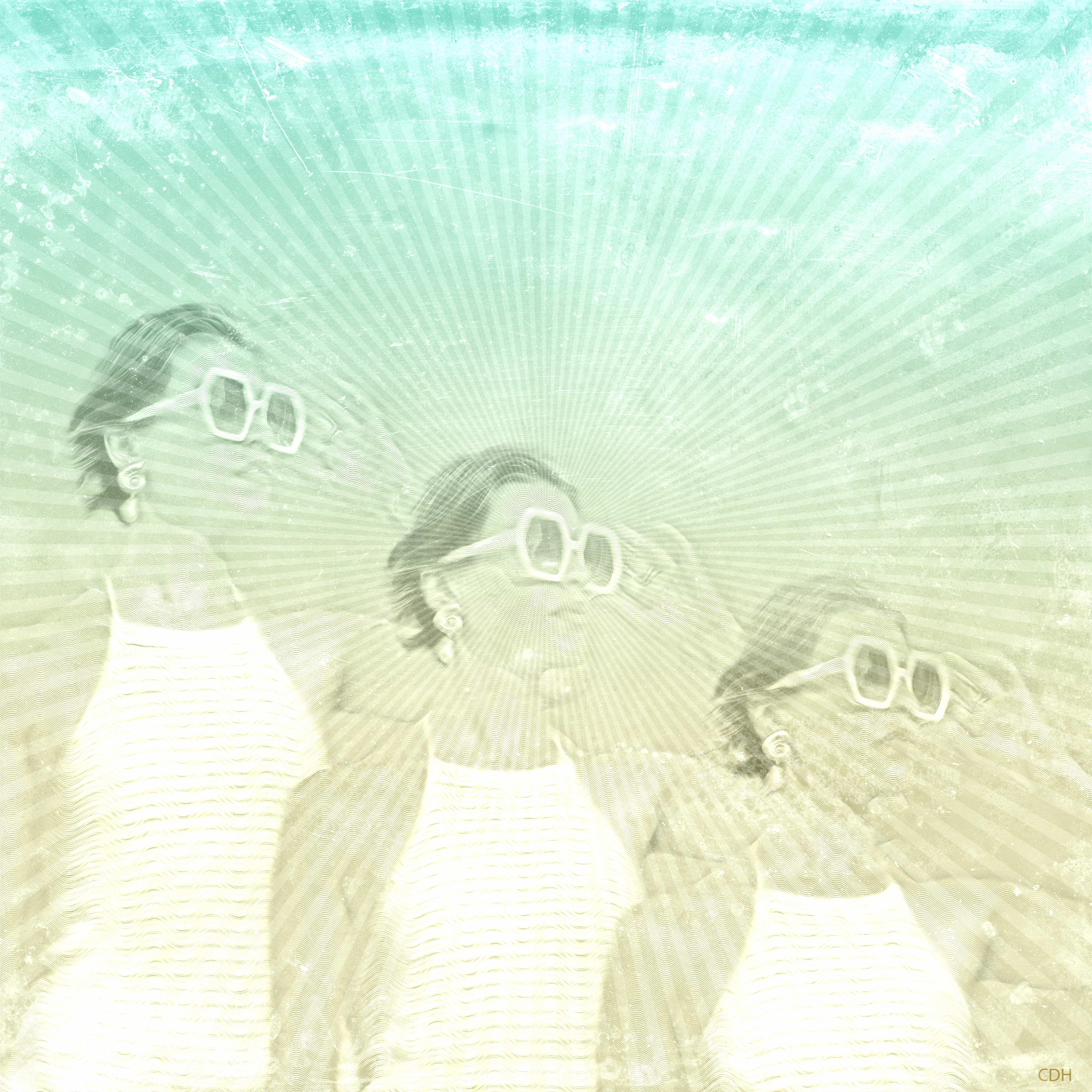
This was the picture I thought I was going to be the most happy with, but I ended up liking the other one better actually. It has more contrast.

The last composite has more contrast and maybe a little less oil paint layers, so that might make it more «popping» in a way.
I want to continue experimenting with different textures and layers, and hopefully I can manage to make one with a more detailed portrait too.
Credits for the photo used in this project and composite: https://tinyurl.com/yc6ypwfd

Leave a comment